
We Design Your Dream Website That Proves Outstanding Everywhere!
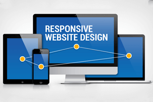
Request a Call Back NowResponsive web design is a fundamental ideology to create a site that not just looks and works at its best but also encompasses an optimal view of all significant information with ease of reading, scrolling, and any other sort of device and/or screen size.
The world is flooded with a wide variety of electronic devices with varied screen sizes, resolutions and interface. Hence, the content on a website must be flexible enough to be viewed on all the devices a user uses to access the internet. A Responsive website design facilitates a website or application to resize and adapt its design and content according to the size of the screen. It increases the development of speed and makes the project manageable. MagicByte Solutions is a reputed Web design Company which strives on designing websites that are responsive, intuitive and scalable.
MagicByte Solutions has emerged as a distinguished responsive web designing company, over the time. We help you make your website highly operative, user-friendly and easy to browse on any device. Our design solutions allow your website to resize and adjust its content as per the size of the screen, which increases its functionality and navigation. We are highly-known for our peerless web design services Australia and the websites created by our proficient web designers offer perfect user experience. We ensure that our responsive website designs are beautiful, as well as responsive enough to be accessed by a large group of adiverse audience.
A good responsive website design increases website traffic by reducing bounce rates, which improves visibility in search engines and enhances customer retention. Our design encompasses an optimal view of all significant information with ease of reading, scrolling, and any other sort of device and/or screen size.
Websites having responsive designs are worthy of providing the ever-increasing population of mobile device users with the best of experience. As a result, it proves helpful in obtaining more and more mobile traffic.
Responsive design uses an approach - “one size fits all” that allows the developers, business owners, and even consumers to perform their role with less headache regarding maintenance. Moreover, the time saved with this tactic can be used to focus on other vital things such as content creation and marketing.
Web pages taking a long time to navigate or finish loading can frustrate consumers to an opinion of no return. However, websites that use responsive design techniques and images ensure good loading speed of web pages, thus, improved user experience.
Keeping the site visitors engaged in order to prevent them from bouncing back is a great challenge. But responsive designs can serve the audiences with a better user experience that make them explore different sections of the website, thus, stay on it for a longer period.
When it comes to the improvement of Search Engine Optimization, responsive web design plays a significant role. It serves the website with not just higher rankings on SERPs but prevention from posts, comments, or other things that impact the site negatively.
Developing a website that looks professional on all the platforms and creates consistent user experience, responsive design acts as a key to convert new customers. It prevents visitors from being frustrated or turns to a competitor, thus ultimately ensure higher conversion rates.
Feel contented as we’ve everything you want! Just check our plans
Request a Call Back NowResponsive web design services Australia help you to get a smooth responsive web design for your business which enables your customers to get easily acquainted and reach for your products and services, regardless of the platform or device they are using. Here are the sequence of steps projecting the effective responsive web design work plan:

With this first step of profound comprehending of the web design process, planning for fine execution of other steps will get easier.

Having brief information about clients’ need, products, and services will aid you in accomplishing the project on time without any complaint from their end.

Researching will support in being familiar with the advancements and changes taking place in the web designing industry. It also provides ideas about the tools, techniques, and strategies your competitors are using.

Now, start with the designing of responsive web pages that encompass not only approachable but also attractive as well as well-organized images and content.

Once tackling the text content and images of the website complete successfully, use your media queries that allow the creation of different web designs for almost all screen sizes.

To access websites, most of the clients prefer mobile devices. Hence, defining breakpoints for these is significant but as future can’t be predicted, set your breakpoints for wide resolutions.
To ensure that your responsive design will work effectively, test the final creation on multiple devices. If any issue disappoints you, resolve the same before final launch.

Once all the outcomes of prototyping test appear fine, go for the ultimate step of launching the product. All the best! Your clients will like it.
There are a number of excellent tools & frameworks that aid in creating exceptional websites. If you don’t have an idea on where to start, the below list of resources will give the spark you require to build an effective and friendly design that functions across all systems and devices.

